


New Mobile Version
December 09, 2014
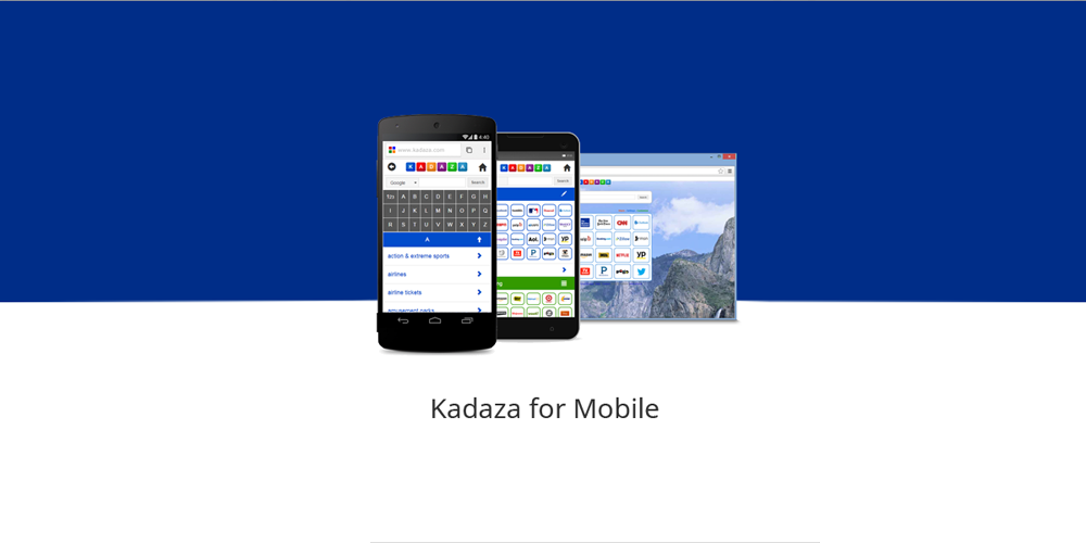
If you visited Kadaza today on your mobile phone you probably noticed some changes. Today our new mobile version went live with some major design and navigation improvements.
The world has become increasingly mobile in recent years, and with more and more people using smartphones as their primary device for browsing the internet. More and more users are visiting Kadaza via smartphones and tablets.
The new mobile version of Kadaza at kadaza.com/m is designed specifically for smartphones and tablets. Our mobile version is now fully responsive, meaning that it adapts to the size of the screen on which it is being viewed. Whether you're using a small smartphone or a larger tablet, Kadaza automatically adapts to your screen, making it easier to navigate the homepage and find what you're looking for.
The layout is clean and uncluttered, making it easy to navigate with a touchscreen. The font size and color contrast are optimized for readability on small screens, and the navigation menu is simplified to make it easy to find the categories you're interested in.
Just head to kadaza.com/m on your mobile browser to get Kadaza on the go, whatever device you’re using.
 Join us on Facebook
 .
.